
Add to Wishlist Button theme block
Add the wishlist button where you want it
Wysh now includes a theme block called Add to Wishlist Button. This lets you place the wishlist button or icon in a specific spot on your product page instead of relying on the default placement.
You add the block directly in the Shopify theme editor, then use the block settings to control the button’s display, colours, text, and spacing.
Where to find the block
In the Shopify theme editor, open a product page template and add the block in the section where you want the wishlist button to appear.
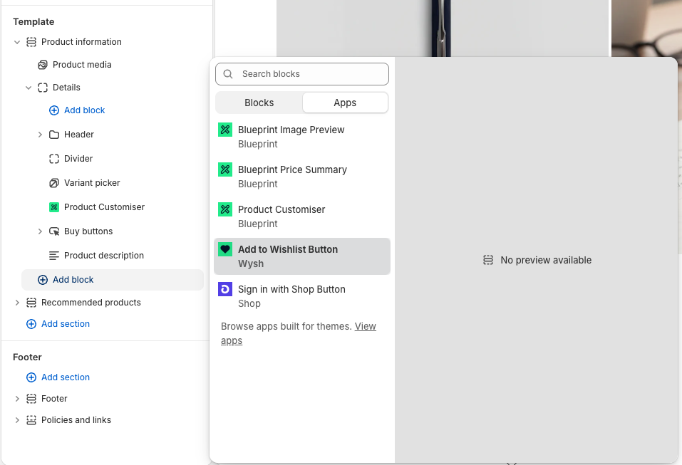
Customise the block
After adding the block, click Add to Wishlist Button in the theme editor sidebar to open its settings.
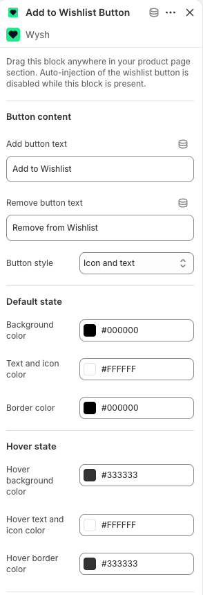
The block includes the following customisation options:
Button content
- Add button text — sets the text shown before an item is saved, such as
Add to Wishlist. - Remove button text — sets the text shown after an item has been saved, such as
Remove from Wishlist. - Button style — controls how the button is displayed, for example Icon and text.
Default state
- Background color
- Text and icon color
- Border color
Hover state
- Hover background color
- Hover text and icon color
- Hover border color
These settings let you match the button to your theme styling while keeping the wishlist action visible on the product page.
Adjust shape and spacing
You can also control the button’s shape and the spacing around it.
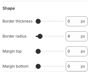
- Border thickness — controls the width of the button border.
- Border radius — controls how rounded the corners are.
- Margin top — adds space above the block.
- Margin bottom — adds space below the block.
These options are useful when you need the wishlist button to sit neatly between existing product page elements.
Best practices
- Place the block close to key purchase actions so customers can easily save products for later.
- Use Icon and text if you want the action to be more obvious to shoppers.
- Match the Default state and Hover state colours to your theme for a more consistent storefront appearance.
What this feature is for
Use Add to Wishlist Button when you want more control over where the wishlist action appears on the product page. It is especially helpful if your theme layout needs the button in a specific content area rather than in the app’s default location.