
How to enable and customise a floating wishlist badge
Enable the floating wishlist badge
The Header/floating wishlist badge settings let you show a fixed wishlist button on the screen instead of placing the wishlist badge inside your header. This is useful if you want the wishlist shortcut to stay visible as shoppers move around your store, and also if you'd like to move away from the standard injection method for the badge within the header.
When Enable floating wishlist badge is turned on, the app shows a floating badge and automatically disables header badge injection.
Go to the Header/floating wishlist badge section in the theme editor by opening the app embed section and expanding Wysh.
Enable the Enable floating wishlist badge toggle.
Use the Position dropdown to place the badge, for example Bottom Right.
Check the badge on your live theme or preview theme to make sure the position and styling fit your layout.
Enabling the floating badge replaces the header-injected wishlist badge. You do not need to configure both at the same time.
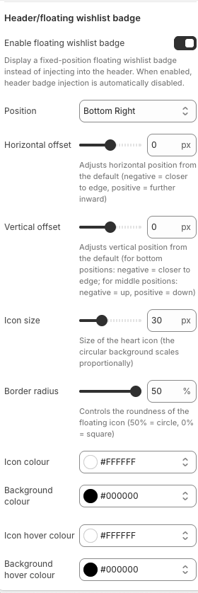
Choose the badge position
Use the Position dropdown to decide where the floating badge appears on the screen. The selected position acts as the starting anchor point for the badge.
For example, if you choose Bottom Right, the badge will sit in the lower-right area of the screen. You can then fine-tune that placement with the offset controls.
Adjust horizontal offset
The Horizontal offset setting changes the badge position from side to side.
For default edge positions, a value closer to 0 px keeps the badge closer to the screen edge.
A higher value moves it further inward.
Use this when the badge feels too close to the screen edge or overlaps with other fixed elements.
Adjust vertical offset
The Vertical offset setting changes the badge position up or down.
For bottom positions, negative values move the badge closer to the bottom edge and positive values move it upward or downward depending on the selected anchor.
The helper text in the app explains how the value behaves for middle positions.
This is especially helpful if your theme has sticky elements, chat widgets, cookie bars, or other floating tools near the same area.
After changing offsets, preview the badge on both desktop and mobile. A position that works well on desktop may sit too close to another floating element on smaller screens.
Customise the floating icon
You can control the size, shape, and colours of the floating wishlist button so it matches your storefront branding.
Change icon size
Use Icon size to change the overall size of the floating icon. The circular background scales proportionally with the icon size, so increasing this setting makes the entire floating button appear larger.
Set the border radius
Use Border radius to control how rounded the floating badge background is.
50% creates a circle.
0% creates a square.
Values in between create rounded corners.
This is the main control for changing the badge from a fully circular button to a softer rounded shape.
Change the default icon and background colours
Use these colour pickers to style the floating button in its normal state:
Icon colour controls the wishlist icon colour.
Background colour controls the button background behind the icon.
If you want a high-contrast floating button, choose clearly different values for the icon and background colours.
Change hover colours
You can also style the hover state using:
Icon hover colour
Background hover colour
These settings control how the badge looks when a shopper hovers over it on desktop. This is useful for adding stronger visual feedback and making the button feel more interactive.
Hover colour settings mainly affect desktop behaviour. On touch devices, shoppers usually see the default state instead of a hover state.
Recommended styling tips
Use a badge position that does not overlap with chat widgets, cookie banners, or mobile sticky buttons.
Keep strong contrast between Icon colour and Background colour for accessibility.
If you use a count badge, make sure the Count badge text colour is easy to read against the chosen background.
Match the Border radius to your theme style: circular for softer modern layouts, or lower radius values for sharper UI styles.
Test the hover state colours to ensure the badge still looks branded and readable when shoppers interact with it.
If your floating badge is too close to the edge or overlaps another fixed element, adjust the horizontal and vertical offsets before changing icon size. Position issues are usually easier to solve with offsets first.
What to check after setup
Once your floating wishlist badge is enabled and styled, confirm the following on your storefront:
The badge appears in the selected Position.
The Horizontal offset and Vertical offset place it correctly on desktop and mobile.
The icon is large enough to tap comfortably.
The normal and hover colours match your brand.
If enabled, the item count bubble is readable and does not sit too far away from the icon.
With these settings, you can create a floating wishlist shortcut that stays visible, fits your theme design, and gives shoppers a clear view of their saved items.